The Challenge
Confused Identity – who are we anyway?
Where do you go to school? North Platte Community College? Mid-Plains Community College? Where did you graduate from? NPCC? MPCC? MCC?
The answer to this question has not always been very clear. Current students, recent graduates, community members, alumni, and even faculty and staff have all struggled to understand the MPCC brand amidst its many different campus names and identities, and subsequently have a hard time connecting with the brand.
Campus Pride
Each college and campus under the MPCC name, prides itself on its own unique community culture. The community in McCook is very different from the community in North Platte and they wouldn’t have it any other way.
Representing the distinct community values, cultures, and identities of the various campuses under the MPCC name remains an ongoing challenge of the institution.
The Proposal
My proposed solution to this challenge came primarily from the ideology of the nation of Canada. Canada thinks of itself as a Mosaic – people of different races, ethnicities, religions, and backgrounds, who are each essential to the makeup of a beautiful whole. No one person must lose their identity in order to belong, but instead, their unique identity adds to the character of the nation. This same mindset could be applied to the unique campuses that make up the wonderful whole that is MPCC.
My plan endeavored to create a campaign that would highlight and celebrate the different campuses while connecting them under the MPCC banner.
The Solution
The WE ARE MPCC Campaign
We are many, in pursuit of something bigger. together.
We are McCook, North Platte, Broken Bow, Imperial, Ogallala, and Valentine.
We are MPCC.
After sharing my proposal with my supervisor in the MPCC Marketing and Public Information Department, and collaborating with the team to create an impactful campaign vision, our team launched a new marketing campaign focusing on raising brand awareness and bringing the MPCC community together. The WE ARE MPCC campaign celebrates the differences of the various campuses as what makes MPCC great.
Once our department finalized the campaign’s vision, as the webmaster and graphic designer, I was tasked with creating a visual identity for the new campaign.
Basic Design & Principle
Visually, what unites MPCC is its official shield logo. No matter where you are, at whichever campus in whatever town, MPCC is the shield.
The WE ARE MPCC campaign design reinforces the MPCC brand by utilizing the various shield elements to subliminally link each new marketing piece to the overall brand in the public’s mind through the MPCC Shield.

Campaign Tag
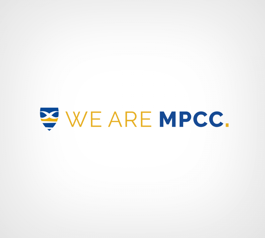
I used a simple typography design for the campaign tag that would not compete with the MPCC shield, but would be easily recognized as our brand and fit seamlessly on a piece.

Campaign Deliverables
Ads, Postcards, and Folders
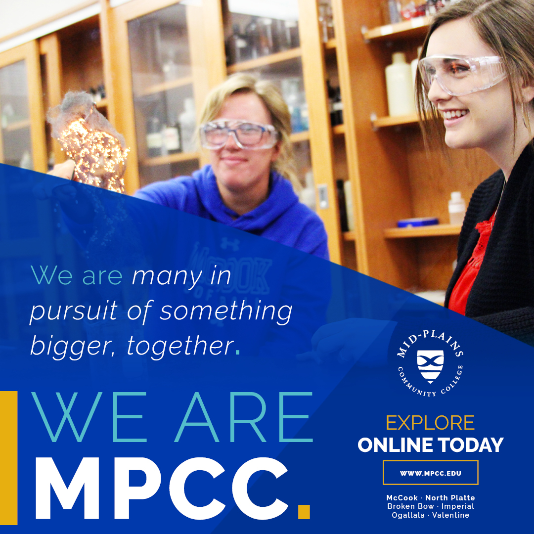
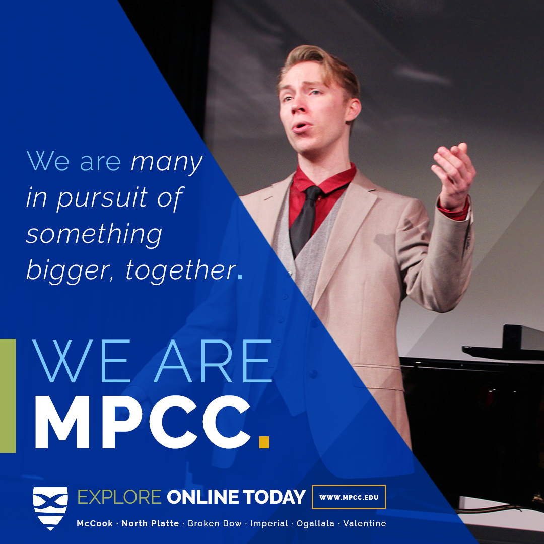
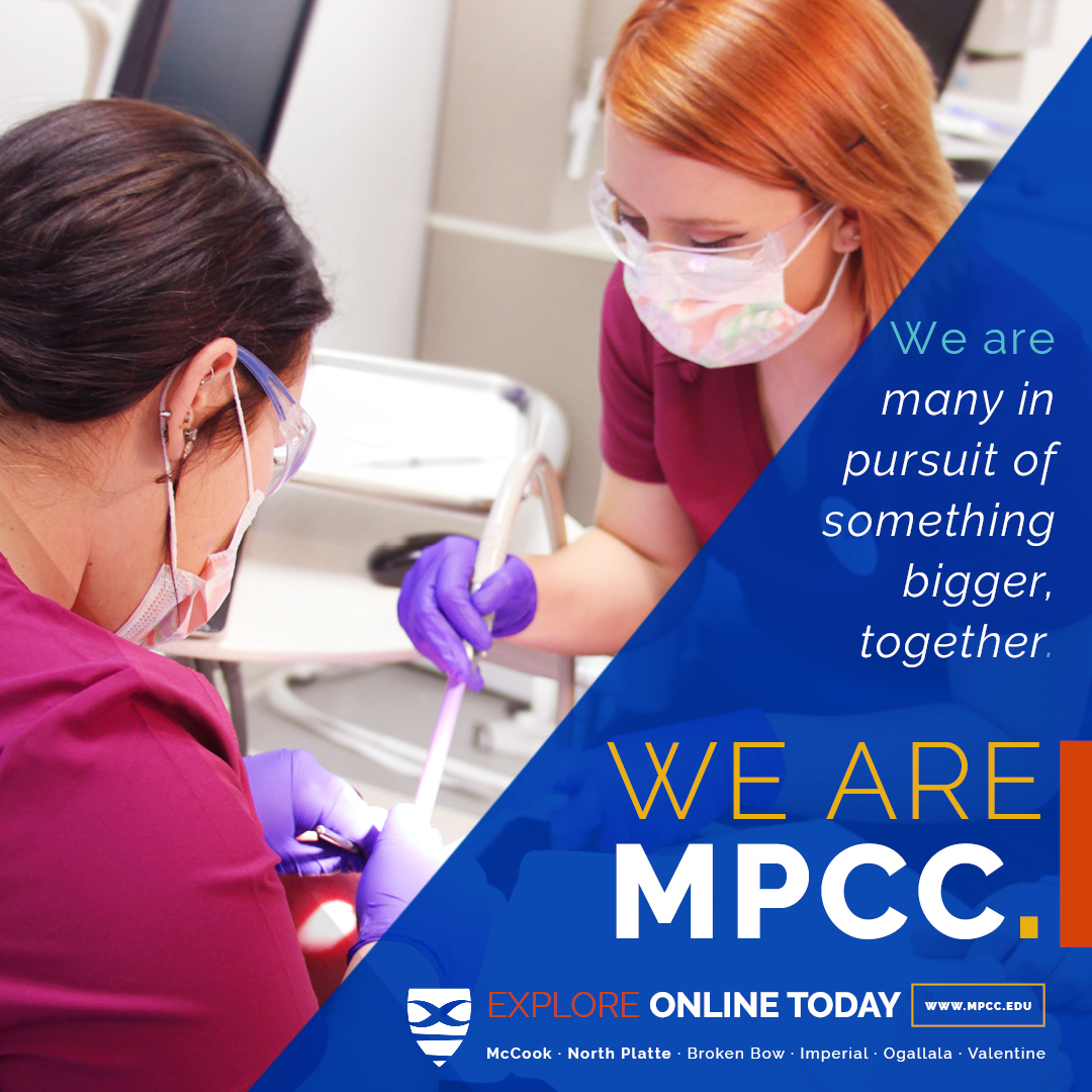
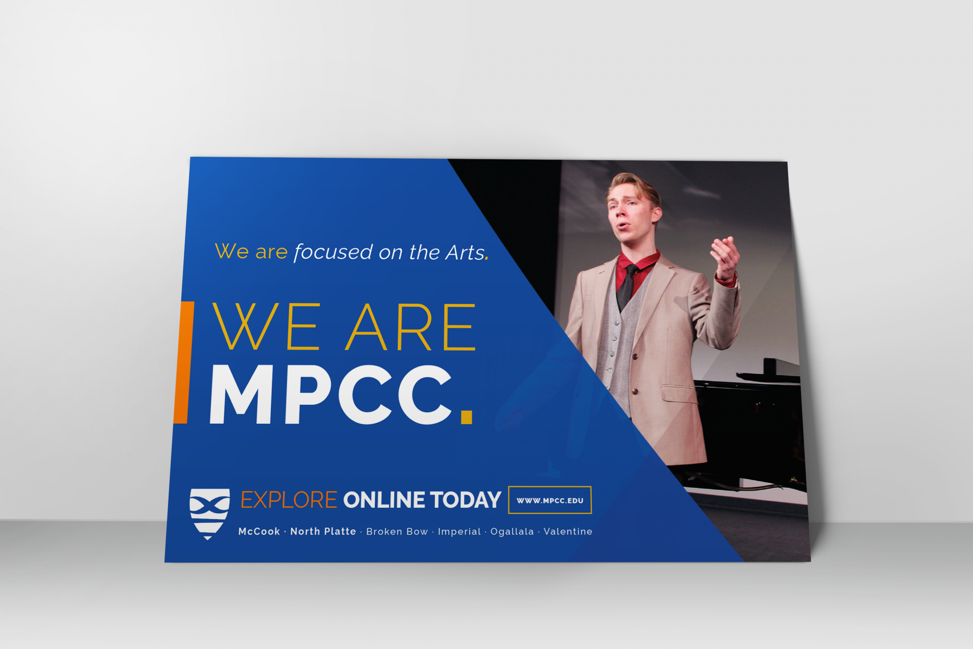
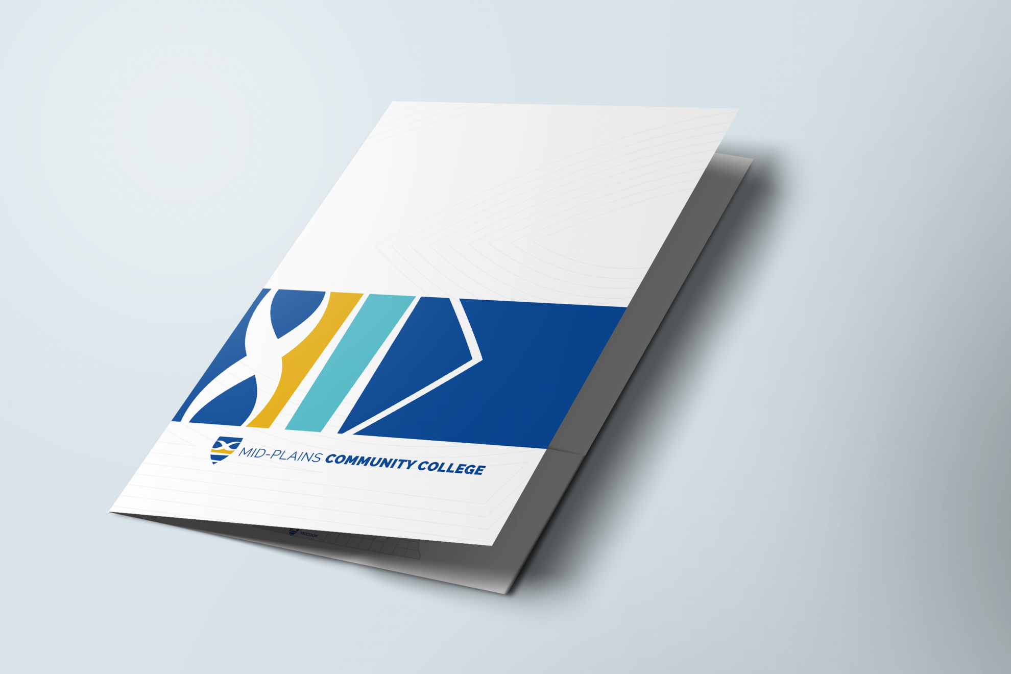
I created ad, postcard, and folder designs to complement the beautiful commercials produced by Digital Brand. I created the unique swooping shapes by blowing up the MPCC Shield and placing them over the vibrant photos taken by the talented photographers in our department. The photography highlights students from all of our different campuses and gives a familiar face to the campaign.
Digital Ads
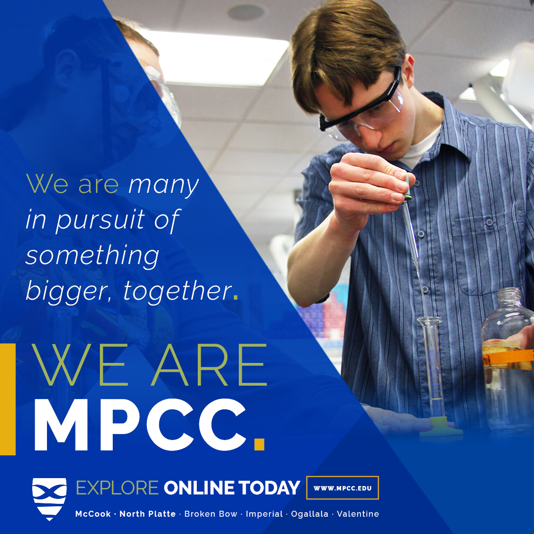
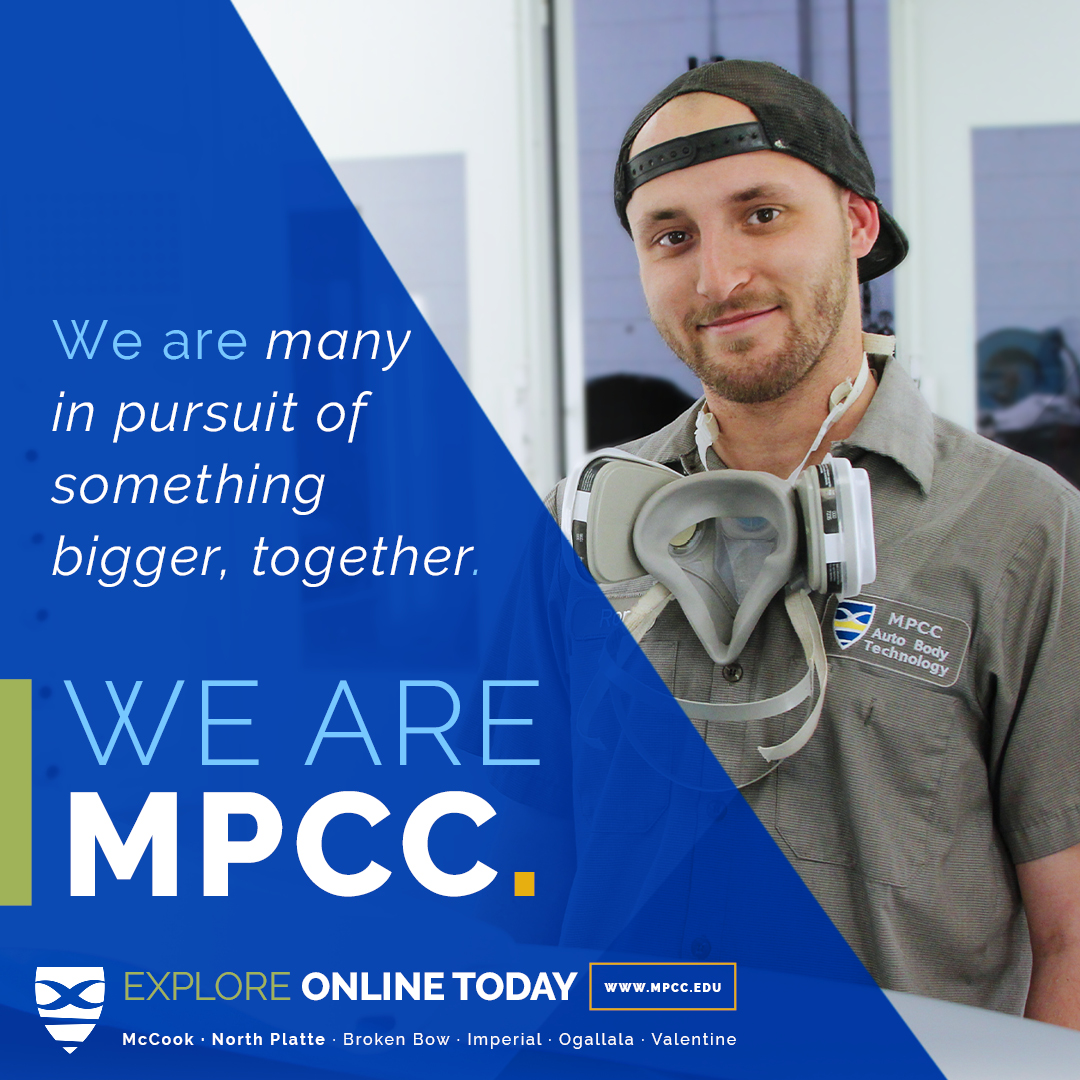
Postcards
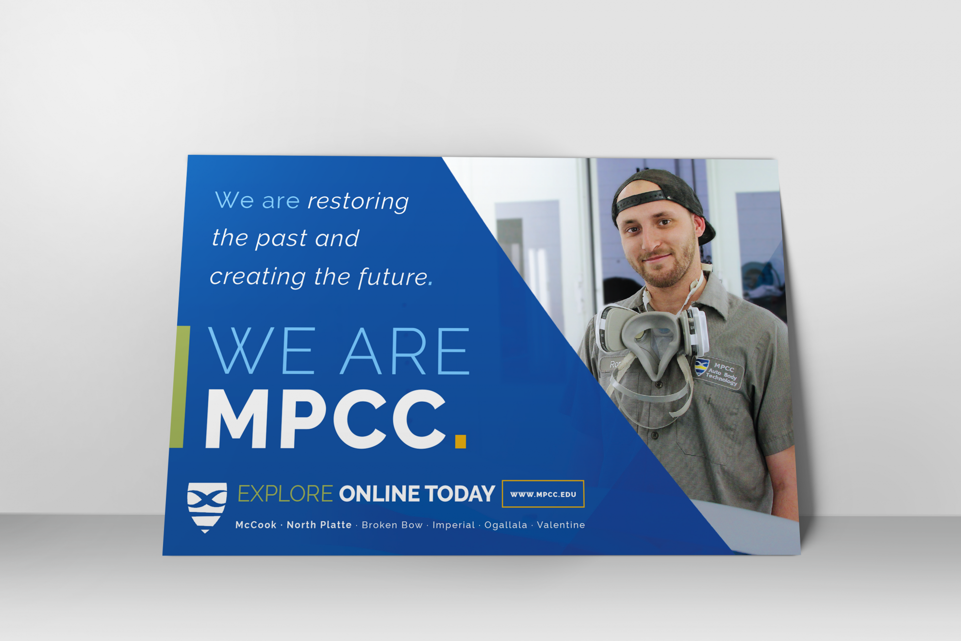

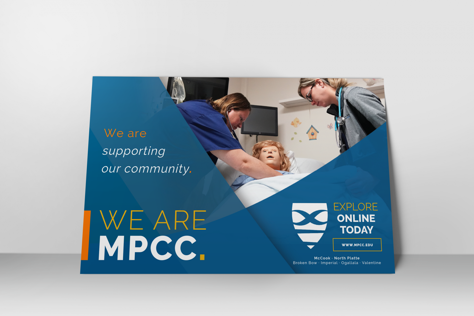
Folders
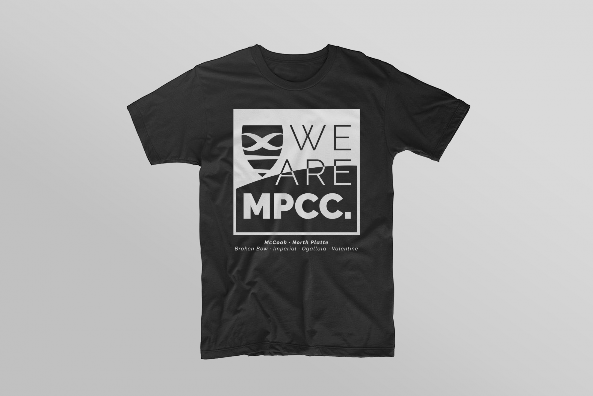
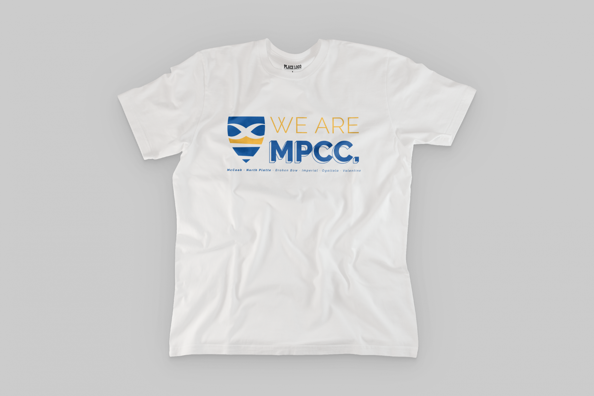
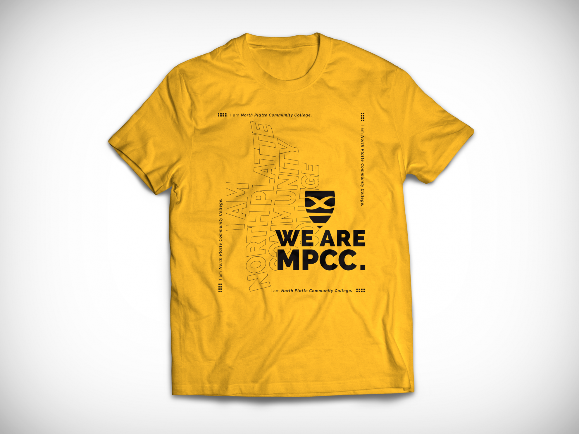
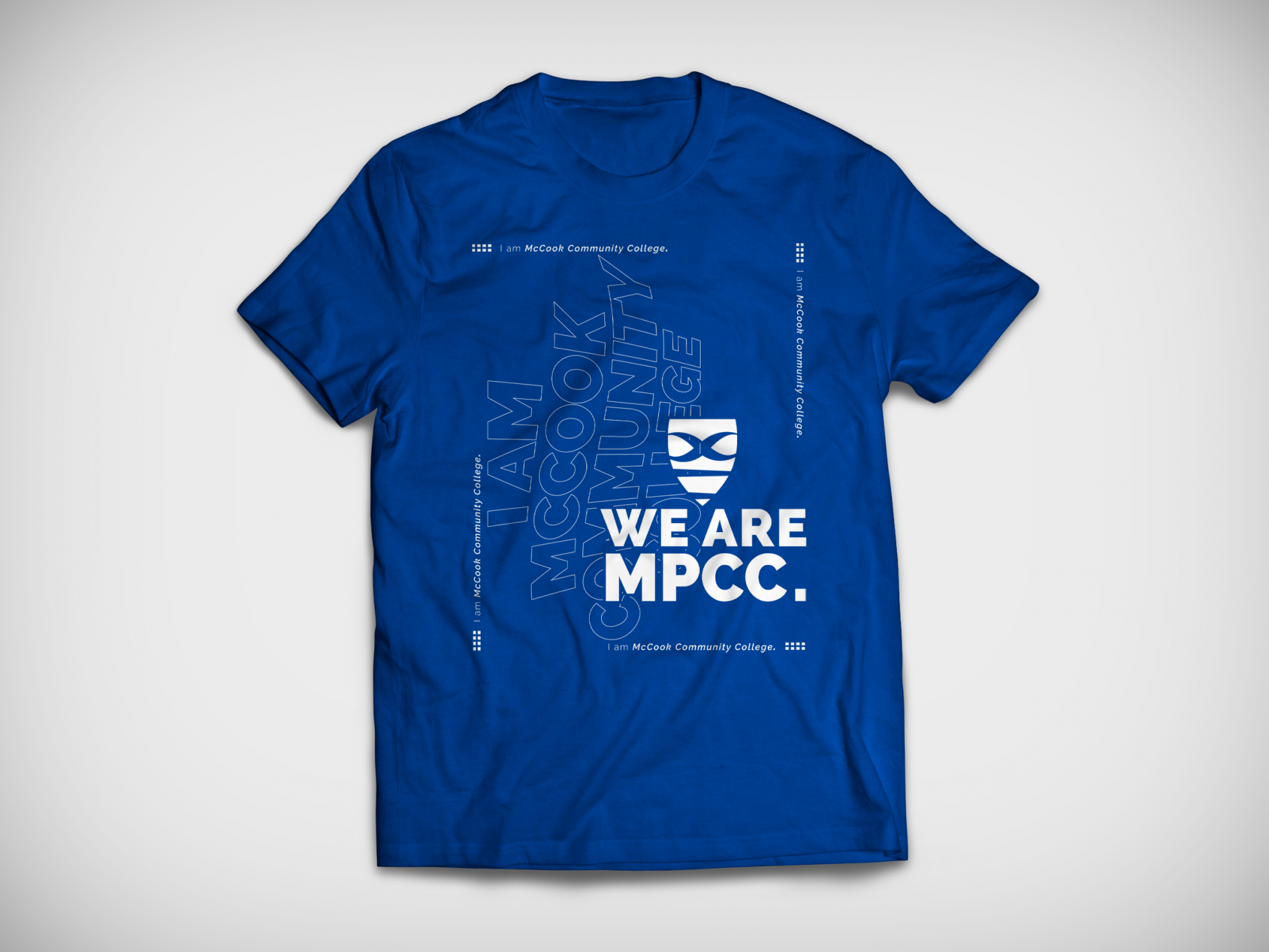
T-Shirts
I created several t-shirt designs for different college events to coordinate with our campaign while representing each event.
